recent posts

Tuesday, October 22, 2013

2 Frankenfurniture

This new credenza/hutch(es) piece in my study is a piece of Frankenfurniture. My husband coined that term when I was putting it together because it really did look like something out of a horror movie--if that horror movie was on HGTV.
I bought this rather substantial credenza on-the-spot when I saw it without thinking it through. 

It had just come into one of my favorite crippy crap furniture stores here in San Antonio and it was massive. It had great clean mid-century lines and something that I always go ga-ga for: chrome. 

The whole footing of the piece was covered in 3 inches of shiny chrome. And you know how I like shiny things. So I bought it for $95 without any real place for it. 
So it sat, and sat, and sat, and sat, and sat. For six months. My husband was very patient, because it took up some seriously valuable real estate in our too-small garage. Over time it became a resting place for bike equipment, tools, scooters, and anything and everything else in our garage. Until one day, while I was at the Pottery Barn Outlet, I came across this piece:

A Pottery Barn entertainment center hutch for a flat screen TV. And it too, was big. I thought, "hey, this piece is big, the credenza is big, maybe I can put this piece on the credenza piece and make a REALLY big piece". Did I have measurements? No. But for $75, I was willing to go with my gut on this one. 

When I got the hutch home, I put it on top of the credenza.


Hmmmm. The proportions were off. Its hard to tell in this picture, but it looked like the furniture equivalent of a short and squatty man with big haunches. It needed to be bigger, higher. And since I decided it needed to go in the study and handle all of my office stuff, I knew it needed another hutch in the middle, for the printer. So I took the measurements of the printer and built this:


About this time in the process my husband was shaking his head. He didn't know what I had gotten myself into. But I had to subject myself to doubtful looks because I couldn't carry any one of the three pieces of this hutch by myself. I asked him to help me drag out the credenza onto the driveway (no easy task!) so I could stack my hutches to see how the proportions looked. And that's when he yelled, "It's Frankenfurniture!"

Although at first I may have been a wee bit offended, I realized quickly he was right. It was definitely Frankenfurniture. It was a bit of a hodge podge, but I had a secret weapon, the same all furniture redo/build enthusiasts use--paint! And my handy dandy sander:


I primed and painted the console, and all of the 8 drawers seperately. As well as the printer hutch. I cut pieces of 1/8 inch plywood for the back of the printer hutch, and then painted them white, then turquoise blue, and attached them to the back.


That's when the weather turned a little nasty, so the Pottery Barn hutch came inside onto the kitchen table. Sorry family! Just eat your cereal on that teeny tiny open corner over there.


I primed and painted this hutch, and built two dividers to hold shelves. I attached those dividers to the top and back of the hutch.


I then attached shelves to the dividers, creating 9 cubbies. I then attached 1 x 2 face frame to the fronts of the plywood shelves to give them a thicker look.


The three pieces were ready to assemble. Which took some serious muscle, and a rented furniture dolly from U-Haul. Did I mention how heavy the console piece was?  I attached the hutches to each other in the back with simple flat brackets and screws. I added some card holder plates and handles to the front of each drawer so I can label what's in them, and filled that sucker up!


I no longer (well almost) have piles of things on the floor and mis-matched storage containers, it all fits nicely into this humongous piece! And although my husband called this piece Frankenfurniture, I don't think he doubted it would be cool when I was done. I try hard to never give him reason to doubt me--because there will always be a new project I will need his help haul around!
jennifer

Thursday, October 17, 2013

0 A Study in "The Big Reveal"


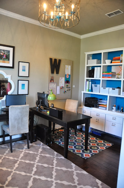
I love when I see "the big reveal" on a blog, when a room is completely re-done with glorious before and after photos that document the unbelievable transformation. I like to oooh and aaah over all of the beautiful details in the photos. I think, "what would it be like to have one room 100% done and ready to go?". Because realistically, I don't think my rooms are ever 100% done. I am really fantastic at 90% to 95% done. That is where I really excel. That last 5% to 10%--not so much. I have been working in a lot of different rooms in my house, and on lots of projects, but I always wonder if it is really big-reveal-ready-to-go-on-the-blog. Since chances are pretty good that it isn't, I've decided to let go of the big reveal and settle for.......wait for it.......the Almost Done Reveal! And since I'm sure it will be a huge hit in the blogosphere, I will go ahead and call it "DecorSanity's Almost Done RevealTM!". OK maybe not. 
When we bought the house, there was a room to the left of the entry way that was used as a dining room. We don't do very much (well...none) formal dining so we decided to turn it into a study. It had a really bad bronze faux painting job and the same tile that plagued my entire downstairs. It was also missing a light fixture since the house was a foreclosure and stripped bare of lights, appliances, plumbing fixtures, even the front automatic wrought iron gate on the driveway. Classy. Here is the before picture.....get ready for it.....

Boom. Revel in it's gross-plainness.  Well, I guess the boom happened after we started removing all. the. (flipping) tile.


The floors were replaced with hardwood and the walls and ceiling were painted Benjamin Moore Revere Pewter. And then we just kinda threw a couple desks and couch in it. And it functioned, but I didn't want to hang out in it--ever. Not enough storage, not cute enough, you get the drill. So we've turned this former dining room into a study I really enjoy working in!


The light fixture is a chandelier in an upside-down basket, which I explained how I made here.


 The console with the hutch is something I put together/built, and I'll post about that project next.


It holds so much storage, all of my office supplies, binders, camera equipment, cables, printer and much more fit into the drawers and shelves. And there is lots of room for the sentimental, pretty, and practical on the shelves. You see that ship-shaped trophy? Let's just say someone in my house was the Carnival Magic's Kids Club Parents' Dance-Off Champion. OK, it was ME!!


 All of the pictures on the wall have some sentimental value. These four prints are of Chicago, where we lived in while my husband was in school.


I've had these four pictures for awhile and wasn't ready to part with them, but they were double-matted with white mats, the outer mat having a black rim on the inside. I decided to brighten them up a bit by painting the outer mat with regular paint. The blue is the same color as the back of the console, and is quite a bit more turquoise than these (dang) pictures. The others are a true red.


The picture of the matador was my inspiration for the color scheme. My husband lived in Spain for two years and we went there for our 5th anniversary. We went to the Plaza de Toros de Madrid (Madrid's bullfighting arena) while we were there, and I found this vintage poster years later at an antique shop.


I gave this photograph "The Bones Brigade" signed by the photographer to my husband for Father's day. It's a really good shot that I think represents what 80's skating looked like....bright neon clothes and hand plants. And for a kid that grew up in San Diego watching these guys at the local skate parks, they were heroes.


And for very practical reasons I included a shoe and sock station in this room, because the kids are always looking for their shoes and socks as they head out the front door. The hooks are for jackets and backpacks.


And now for the list of the 5% to 10% that's not done--board and batten on the walls, recovering or replacing the sofa with something more colorful, built-in lockers for the shoes, jackets and backpacks. And I'm sure other things I haven't thought of yet. But for now, I'm really enjoying the space, and love spending time in it--and thinking about when to get started on the rest of it!


jennifer